I would really like these someday when I have money. I don't think I've ever owned a pair of Adidas shoes (I'm a New Balance girl). Since I can't have them now, the closest I can come is drawing them.
Sunday, March 27, 2011
Blue suede shoes for your rainy day blues
And you thought they were going to be Chuck Taylor Converse All-Stars, didn't you? (Those blue suede ones sell custom for $75.)

Thursday, March 24, 2011
Facebook news and visual cues
This is an interesting piece I saw in this issue of CMYK: Episodic Memory, Semiotics of Facebook by Annabel Mangold, a student from Portfolio Center. Her portfolio is featured on CMYK, and she was recently interviewed by GD USA.


I like the iconic blue of Facebook and how it's layered onto the newspaper with interesting symbols and type.
"To me, studying design is studying life. It is a wonderful blend of psychology, aesthetics, pragmatics, and the ethereal. I study design to ultimately find my own truth, communicating my perspective to others as a part of an ongoing dialogue. I study design to learn and to be challenged. It is my belief that by becoming a designer, I will practice a profession where one's work and one's purpose are closely aligned — and that excites me. I want to design transparent, effective systems that encourage and support individuals and entities." (Annabel Mangold, GD USA interview)
Wednesday, March 23, 2011
Word of the day: etoecology
(to find out the meaning, watch the film)
(Produced by by Ornana films)
(notes on) biology from ornana films on Vimeo.
The Art Spirit

I am currently reading The Art Spirit by Robert Henri, which is a guide of technical practices in painting along with wisdom and philosophy of art-making. It is filled with rich advice and great quotes. I highly recommend it to my peers.
I was reading a bit of it yesterday and found this passage to be relevant to my life currently:
"The wise draftsman brings forward what he can use most effectively to present his case. His case is his special interest- his special vision. He does not repeat nature... When a fine dancer appears before you in a very significant gesture, you are caught only by the folds of her drapery which respond to the great will in her movement. She has established in you a trend of interest. What enters your vision is only the sequences of this established interest. When gamblers play in luck, when they continue to win, seem to have a knowledge of how the card will turn, they may be said to have fallen in with one of the courses nature takes. They do not know it, but there are sequences and sequences, untold numbers of them overlaying, intermingling. Every movement in nature is orderly, one thing the outcome of another, a matter of constructive, growing force. We live our lives in tune with nature when we are happy, and all our misery is the result of our effort to dictate against nature. In moments of great happiness we seem to be with the universe; when all is wrong we seem to be alone, disjointed. Things are going on without us..." (Robert Henri, The Art Spirit)
Can I be honest here? I don't usually write about my personal life on this blog, but I'm struggling right now. In the context of Henri's passage, I've been dictating against nature for too many months. I made a commitment at the beginning of this year to start improving my attitude and doing the best I could to take care of my health, spiritually, mentally and physically. I have improved, and am excited about the vast possibility of growth (as always). I have been very financially challenged and although my lifestyle does not require much, it is debilitating in other ways. I tried to move to a larger city late last year, but this failed when I could not find a job fast enough. I was running out of money, so much to the point of planning my last trip to the city to accomplish everything in those few days from looking at the cheapest living space I could find to an interview that I had been granted at a wonderful firm in the city. This was planned all in the same 2 days to save on gas so I could deposit the rest on the shared room I found. The only problem was that it took substantially more to move in than 2 months rent. The interview was for a paid internship, and although it was a great opportunity and the firm liked my work, I couldn't start out with less than $2,000.
Furthermore, I damaged a friendship by taking advantage of someone when trying to find a job and get a start there. It was not my intention at all, but my lack of communication was a main factor here. I left the city discouraged and frustrated with myself, in desperate need of healing and a reevaluation of my so called dreams. I've used the time since then to change and improve. I felt that I had failed miserably by the whole experience, but at the same time, I learned things that could not have been taught to me any other way. I had two offers for internships and I know with everything in me that I could have made it if I had the money to start out, and that is encouraging.
I know who I am. Among many things, I am a dreamer, and this can be a blessing and a curse. There is so much I want out of life and I can feel the push of reality urging me to let go of the things it deems impossible or unfit for me. I am developing a judgement of knowing what to give up and what to keep, from personal qualities to ambitions. I won't grow to be satisfied and complacent if I do not achieve that which I have set out to do, yet I will learn to forfeit the extraneous for that which is more important overall. There are things which aren't worth sacrificing your values for, and there are other things that you must adjust to meet if you really want them. I am learning to enjoy the small things and looking for the good in these trying circumstances while keeping hope and a determination and not settling. As a dreamer, I will always push myself to be and accomplish more.
I know I need to be better, but furthermore, I know I can and I will, because I won't stop.
Tuesday, March 22, 2011
Painter: Ian Francis

Ian Francis is a painter based in Bristol, England. He attended the University of the West of England for his BA degree, and frequently shows at Lazarides Gallery in London, among a couple places in the U.S. His latest show, Fireland, can be found at the Joshua Liner Gallery in NYC until April 2.


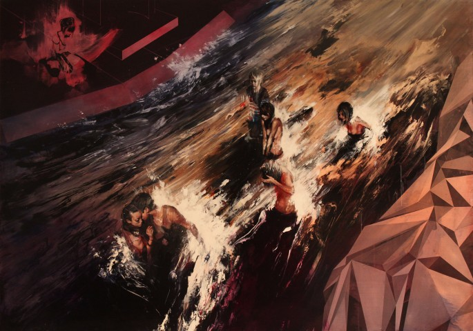

I am in love with Ian Francis' work. His style combines a spontaneous application of paint freely with areas that get tighter in form to create a juxtaposition of the intricate and the direct. Layers of washes create a rich surface in which the forms find definition, then digress. It gives the appearance of half-recalled dreams or incomplete memories.
He's done some great pieces in 2011 already, which you can check out on his site. Also, see his blog to discover more about his process. He posts bits and pieces of what he's working on, his inspiration, photos, and sketches. Fecal Face did a great interview with Ian awhile back, which reveals a bit more about his process:
"I normally describe what I do as mixed media painting... the idea is to get different kinds of marks to work off of each other - so sometimes I'll paint/draw fairly accurately, then work quite loosely on a section, then break up elements of print on another section. At the moment I think a lot of the painting I do is too tight, it should really be looser and more expressive." (John Trippe, Fecal Face)
Happy 5 years, Twitter!
Twitter made a video in honor of its 5 year birthday (yesterday), showcasing its use by celebrities and workers in different industries:
Monday, March 21, 2011
Irish coffee cupcakes

I also found a bunch of traditional Irish recipes on chow.com, including boxty and Guinness chocolate ice cream (if you have an ice cream maker). It makes me really miss Ireland.
Tuesday, March 15, 2011
Reebok gets its Zig on
March Madness has progressed to the bracket stage, and while watching ESPN for stats, I happened to see this new spot for Reebok's ZigTech shoes ("the energy drink for your feet"). I like the fun mix of animation becoming the real athlete in the end. I saw the one featuring John Wall, but I love the music for the one with Peyton Manning (both shown below). There's also spots with Iker Casillas, Alexander Ovechkin, and Mahendra Singh Dhoni (he jumps over a cow!).
The ads were created by DDB (Berlin), who have worked with Reebok for the past two years. According to Ad Age, "In 2010, the athletic brand nearly tripled its measured media spending in the U.S. to $75.7 million, with $38 million devoted to ZigTech and $31 million to EasyTone."
And it's been paying off. Sales grew about 12% in 2010, and with the ongoing momentum of advertising, Reebok anticipates more in 2011.
Richard Prenderville, VP-global brand marketing at Reebok comments on the attitude of the brand:
"We walked into the relationship with DDB saying we've always had a different take on the world. All the other brands take more of a blood, sweat and tears approach. We think fun is more of a sustaining motivational factor. Having fun staying in shape is our strategic territory." (Advertising Age)
Sunday, March 13, 2011
Fellow young designers- did you catch this in HOW?

January's issue of HOW Magazine published an article by Doug Bartow (29 Things that All Young Designers Need to Know), which I found very useful. I was reading the magazine in B&N and had to copy down a few notes in my sketchbook. I've thought of it several times over the past couple months since reading it.
Here's a few great suggestions for example, but there are so many others (I also like 9, 12, and 23).
Really though, it's a great article that will remind you of a few things and teach you a few more, so go read it!
3. Don't fear type; become its master.
Often, being a good typographer means not making the simple mistakes. To accomplish this, you’ll need a working knowledge of classical typography. Go get one. “The Elements of Typographic Style” by Robert Bringhurst, “Thinking With Type” by Ellen Lupton and “Grid Systems in Graphic Design” by Josef Müller-Brockmann are cover-to-cover must-reads. Repeat after me: “Free fonts from the internet are crap, I will not use them.” Keep saying that.
4. Define your audience.
Who are you speaking to and what is the objective? If you can’t definitively answer both of these questions about a project you’re about to start working on, go back to the drawing board. Graphic design is simply a plan that visually articulates a message. Make sure you have the message and its intended viewer sorted out before you start making. Communicate with purpose—don’t just make eye candy.
15. Content is still king.
Technically, Elvis is still the king, but for the sake of this argument, let’s put an emphasis on the message, and consider design as a plan for delivering it. The most effective and memorable visual communication almost always has the right mix of form and content, regardless of medium. Good design can engage a viewer, but interesting content will keep them reading, and thinking, past the headline.
27. Remember that your Mac is a tool.
Twenty years ago, many people in our industry were sure that desktop publishing would mark the end of professional graphic design as we knew it. They confused the convenience of new technology with the skill and passion required to design with it. Take a good look at your design methodology and the role technology plays in your work. Can you select “Shut Down” and still be an effective visual communicator? Practice that.
Really though, it's a great article that will remind you of a few things and teach you a few more, so go read it!
Saturday, March 12, 2011
Illustrator: Carine Brancowitz
Carine Brancowitz is a French illustrator who reminds me a bit of Andrea Joseph, one of my favorites. Brancowitz uses brilliant colors of ballpoint pens and intricate patterns to create interesting compositions. Furthermore, these drawings are not limited to small sketchbook pages, but some reach to almost 4 feet! The work is trendy, but in a good way. Check out her portfolio on her site (both client and personal), and watch the video to get a closer look (it's different from any "showcase" video I've seen).
I was interested in her bio, and according to Rich Soil Clothing, Carine "spent her childhood in the woods of her family's castle in France. When she turned 16, she moved to Paris to study illustration at the Paris school of arts, Ecole Estienne. Her career began in 1996 as the Junior Art Director at a Parisian communications agency specializing in fashion and trends."
...Her family has a castle??


Friday, March 11, 2011
Chronicle Books Design Fellowship poster
 Nice 2-color silkscreen informational poster designed by Wilfred Castillo and Supriya Kalidas for Chronicle Books Design Fellowship. Both designers have experience with the Fellowship, so it's cool they could create the poster for them.
Chronicle Books Design Fellowship is taking applications for the summer & fall of this year until April 11, 2011, f.y.i. Sounds like a valuable opportunity and you could see San Francisco!


Effective design on a budget

I can't get over this low-budget letterhead package designed by Chris Richardson for Peace Corps at 50. The project utilizes 2 different stamps to create nice texture and overall effect. Other printing costs included labels, but the total production was $70, including paper. I also like the use of Bodoni and Akzidenz Grotesk in the type.
It beautifully demonstrates how to wisely use resources and good fundamental design to create an identity that doesn't cost hundreds, but is just as appealing and effective.


It's as if Elvis came back to life and signed her car!
Usually, I'm hesitant about car stickers/decals, but this one is an automatic win. Also, I must add that although I like Elvis, there is a lot of tacky memorabilia out there and I'm glad this doesn't fall into that category. My sister just put this vinyl sticker on her new car. You can get one from Amazon (and at a price of $3, I suggest you do).

Tuesday, March 8, 2011
Better Half Ale

I love hand-drawn script, especially when it looks carefree and natural. This lovely label comes from VSA Partners (NY), made for a Valentine's Day exhibition, g(love), with Stephen Antonson. Clever name for the ale, considering the show. The Chelsea Brewing Company supplied the beverages.
"Artist Stephen Antonson paired up with VSA NY to present g(love), a singular exhibition inspired by the bittersweet feeling of love lost and found. G(love): A Valentine from Stephen Antonson and VSA showcased 21 framed pairs of gloves and mittens picked up off the streets of New York and lovingly mismatched by Antonson.
VSA treated more than 175 of our friends and associates to a signature blonde ale and a complimentary set of postcards featuring pieces from the show. Antonson’s Icicle Chandelier and birch wood lamps provided warmth and whimsy that transformed VSA NY into a gallery for one festive evening." (-VSA)


Monday, March 7, 2011
Meggs

Meggs is a contemporary artist featured on the NB574 project started by New Balance. The project showcases the careers of 5 creative Australians, following them over the span of four months through photography and video. Check out Meggs within the project.
For me it's about the middle ground, I guess, between the darker aspects of life and the optimism, the good aspects... It's like I find it's that internal search about balance, about one's life being balanced, I mean, like you've got between morals and desires and all that sort of stuff, which I think about a lot.
NB574.com | Meggs | Part 01 from NB 574 on Vimeo.
Friday, March 4, 2011
Daft Coke


Thursday, March 3, 2011
Need a laugh?
Here are some of my favorite funny sites, in case you need a break:


You may have heard of Fail Blog, Texts From Last Night, Stuff White People Like, and People of Walmart.
I've started reading Hyperbole and a Half by Allie Brosh at the suggestion of my dear friend, Diana. I was skeptical at first when seeing illustrations done in Microsoft Paint, but was won over after reading the hilarious and well-written stories that went with these outrageous and fitting drawings.

Damn You, Auto Correct!- Gotta love when technology screws up a message.

For the photographers:

Awkward Family Photos- conjures up memories of Olan Mills in my best 90's floral prints and lace, except much worse and funnier.
For the English majors:

For the Designers:

Clients From Hell- actual conversations and ridiculous requests from difficult clients.
Photoshop Disasters- maybe it was 3 a.m. or maybe they were drunk?
A few more random ones:
I hope you get some good laughs!