Jenny Holzer was born July 29, 1950 and is considered an American Conceptual artist. She works with type and finds different ways to display her work in public places, such as through L.E.D. signboards, xwnon projections, and engraved on marble benches, cast in bronze plates, or etched in copper. Truisms were printed on posters and put up around Manhattan. Pedestrians scribbled responses and comments to these on the posters and sometimes Holzer would even stand and listen to conversations they envoked on the street. She's been in the Guggenheim Museum and participated in the Venice Biennale in 1990 and the first Florence Biennale in 1997.a little knowledge can go a long way
a lot of professionals are crackpots
a man can't know what it is to be a mother
a name means a lot just by itself
a positive attitude means all the difference in the world
a relaxed man is not necessarily a better man
a sense of timing is the mark of genius
a sincere effort is all you can ask
a single event can have infinitely many interpretations
a solid home base builds a sense of self
a strong sense of duty imprisons you
absolute submission can be a form of freedom
abstraction is a type of decadence
abuse of power comes as no surprise
action causes more trouble than thought
alienation produces eccentrics or revolutionaries
all things are delicately interconnected
ambition is just as dangerous as complacency
ambivalence can ruin your life
an elite is inevitable
anger or hate can be a useful motivating force
animalism is perfectly healthy
any surplus is immoral
anything is a legitimate area of investigation
artificial desires are despoiling the earth
at times inactivity is preferable to mindless functioning
at times your unconsciousness is truer than your conscious mind
automation is deadly
awful punishment awaits really bad people
bad intentions can yield good results
being alone with yourself is increasingly unpopular
being happy is more important than anything else
being judgmental is a sign of life
being sure of yourself means you're a fool
believing in rebirth is the same as admitting defeat
boredom makes you do crazy things
calm is more conductive to creativity than is anxiety
categorizing fear is calming
change is valuable when the oppressed become tyrants
chasing the new is dangerous to society
children are the most cruel of all
children are the hope of the future
class action is a nice idea with no substance
class structure is as artificial as plastic
confusing yourself is a way to stay honest
crime against property is relatively unimportant
decadence can be an end in itself
decency is a relative thing
dependence can be a meal ticket
description is more important than metaphor
deviants are sacrificed to increase group solidarity
disgust is the appropriate response to most situations
disorganization is a kind of anesthesia
don't place to much trust in experts
drama often obscures the real issues
dreaming while awake is a frightening contradiction
dying and coming back gives you considerable perspective
dying should be as easy as falling off a log
eating too much is criminal
elaboration is a form of pollution
emotional responses ar as valuable as intellectual responses
enjoy yourself because you can't change anything anyway
ensure that your life stays in flux
even your family can betray you
every achievement requires a sacrifice
everyone's work is equally important
everything that's interesting is new
exceptional people deserve special concessions
expiring for love is beautiful but stupid
expressing anger is necessary
extreme behavior has its basis in pathological psychology
extreme self-consciousness leads to perversion
faithfulness is a social not a biological law
fake or real indifference is a powerful personal weapon
fathers often use too much force
fear is the greatest incapacitator
freedom is a luxury not a necessity
giving free rein to your emotions is an honest way to live
go all out in romance and let the chips fall where they may
going with the flow is soothing but risky
good deeds eventually are rewarded
government is a burden on the people
grass roots agitation is the only hope
guilt and self-laceration are indulgences
habitual contempt doesn't reflect a finer sensibility
hiding your emotions is despicable
holding back protects your vital energies
humanism is obsolete
humor is a release
ideals are replaced by conventional goals at a certain age
if you aren't political your personal life should be exemplary
if you can't leave your mark give up
if you have many desires your life will be interesting
if you live simply there is nothing to worry about
ignoring enemies is the best way to fight
illness is a state of mind
imposing order is man's vocation for chaos is hell
in some instances it's better to die than to continue
inheritance must be abolished
it can be helpful to keep going no matter what
it is heroic to try to stop time
it is man's fate to outsmart himself
it is a gift to the world not to have babies
it's better to be a good person than a famous person
it's better to be lonely than to be with inferior people
it's better to be naive than jaded
it's better to study the living fact than to analyze history
it's crucial to have an active fantasy life
it's good to give extra money to charity
it's important to stay clean on all levels
it's just an accident that your parents are your parents
it's not good to hold too many absolutes
it's not good to operate on credit
it's vital to live in harmony with nature
just believing something can make it happen
keep something in reserve for emergencies
killing is unavoidable but nothing to be proud of
knowing yourself lets you understand others
knowledge should be advanced at all costs
labor is a life-destroying activity
lack of charisma can be fatal
leisure time is a gigantic smoke screen
listen when your body talks
looking back is the first sign of aging and decay
loving animals is a substitute activity
low expectations are good protection
manual labor can be refreshing and wholesome
men are not monogamous by nature
moderation kills the spirit
money creates taste
monomania is a prerequisite of success
morals are for little people
most people are not fit to rule themselves
mostly you should mind your own business
mothers shouldn't make too many sacrifices
much was decided before you were born
murder has its sexual side
myth can make reality more intelligible
noise can be hostile
nothing upsets the balance of good and evil
occasionally principles are more valuable than people
offer very little information about yourself
often you should act like you are sexless
old friends are better left in the past
opacity is an irresistible challenge
pain can be a very positive thing
people are boring unless they are extremists
people are nuts if they think they are important
people are responsible for what they do unless they are insane
people who don't work with their hands are parasites
people who go crazy are too sensitive
people won't behave if they have nothing to lose
physical culture is second best
planning for the future is escapism
playing it safe can cause a lot of damage in the long run
politics is used for personal gain
potential counts for nothing until it's realized
private property created crime
pursuing pleasure for the sake of pleasure will ruin you
push yourself to the limit as often as possible
raise boys and girls the same way
random mating is good for debunking sex myths
rechanneling destructive impulses is a sign of maturity
recluses always get weak
redistributing wealth is imperative
relativity is no boon to mankind
religion causes as many problems as it solves
remember you always have freedom of choice
repetition is the best way to learn
resolutions serve to ease our conscience
revolution begins with changes in the individual
romantic love was invented to manipulate women
routine is a link with the past
routine small excesses are worse than then the occasional debauch
sacrificing yourself for a bad cause is not a moral act
salvation can't be bought and sold
self-awareness can be crippling
self-contempt can do more harm than good
selfishness is the most basic motivation
selflessness is the highest achievement
separatism is the way to a new beginning
sex differences are here to stay
sin is a means of social control
slipping into madness is good for the sake of comparison
sloppy thinking gets worse over time
solitude is enriching
sometimes science advances faster than it should
sometimes things seem to happen of their own accord
spending too much time on self-improvement is antisocial
starvation is nature's way
stasis is a dream state
sterilization is a weapon of the rulers
strong emotional attachment stems from basic insecurity
stupid people shouldn't breed
survival of the fittest applies to men and animals
symbols are more meaningful than things themselves
taking a strong stand publicizes the opposite position
talking is used to hide one's inability to act
teasing people sexually can have ugly consequences
technology will make or break us
the cruelest disappointment is when you let yourself down
the desire to reproduce is a death wish
the family is living on borrowed time
the idea of revolution is an adolescent fantasy
the idea of transcendence is used to obscure oppression
the idiosyncratic has lost its authority
the most profound things are inexpressible
the mundane is to be cherished
the new is nothing but a restatement of the old
the only way to be pure is to stay by yourself
the sum of your actions determines what you are
the unattainable is invariable attractive
the world operates according to discoverable laws
there are too few immutable truths today
there's nothing except what you sense
there's nothing redeeming in toil
thinking too much can only cause problems
threatening someone sexually is a horrible act
timidity is laughable
to disagree presupposes moral integrity
to volunteer is reactionary
torture is barbaric
trading a life for a life is fair enough
true freedom is frightful
unique things must be the most valuable
unquestioning love demonstrates largesse of spirit
using force to stop force is absurd
violence is permissible even desirable occasionally
war is a purification rite
we must make sacrifices to maintain our quality of life
when something terrible happens people wake up
wishing things away is not effective
with perseverance you can discover any truth
words tend to be inadequate
worrying can help you prepare
you are a victim of the rules you live by
you are guileless in your dreams
you are responsible for constituting the meaning of things
you are the past present and future
you can live on through your descendants
you can't expect people to be something they're not
you can't fool others if you're fooling yourself
you don't know what's what until you support yourself
you have to hurt others to be extraordinary
you must be intimate with a token few
you must disagree with authority figures
you must have one grand passion
you must know where you stop and the world begins
you can understand someone of your sex only
you owe the world not the other way around
you should study as much as possible
your actions are pointless if no one notices
your oldest fears are the worst ones
Thursday, January 29, 2009
Truisms
While watching Helvetica Tuesday, I saw something interesting in the background of Sagmeister's office. It was a bunch of sentences of short wisdom. There were so many that they were framed in 3 panels, side by side. I kept reading them as Sagmeister was talking. Phrases like, "If you live simply there is nothing to worry about," and "Push yourself to the limit as much as possible." I love these type of things and was glad to see that Sagmeister may find inspiration or wisdom within them too. I looked it up online to find that this list called Truisms started in 1977 by Jenny Holzer. Here they are:
Wednesday, January 28, 2009
Tate
The Tate galleries, often referred to as The Tate, consist of four galleries in the U.K. (Tate Modern, Tate Britain, Tate Liverpool, and Tate St. Ives). It was named after its founder, Sir Henry Tate. The original Tate Gallery opened in 1897 at Millbank in London. It was affiliated with the National Gallery until 1955. The latest branch of the Tate (The Tate Modern) was established in 2000.
Also at this time, due to the recent launch of the Tate Britain and Tate Modern, it was decided that a rebranding was necessary for this new start. Wolff Olins designed the new brand, making it fresh and colorful. He created four different type treatments to go on his custom-designed typeface which blurred the letters and played with different amounts of visual focus. There is a standard logo, a blurred logo, a faded logo, and a halftone logo. "Allowing flexibility within a unified identity, the design conveys transformation and nonconformity. Tate's luminous and expansive color palette is unpredictable and fresh," (Designing Brand Identity by Alina Wheeler, p. 253). There are 18 colors in the palette which are divided into strong hues and subtle hues.
The brand is very successful. It is unique in the way that the type is handled. As designers, we're constantly striving for clearness and legibility. If someone is trying to blur type and make it look out of focus, it can easily mess up legibility. However, the Tate logo is still easy to read and is different from most other brands, making it stand out and remain recognizable. It is consistent in the look and feel, yet dynamic and flexible enough to be shown in different ways, with different colors and still remain within the identity of the brand. It clearly "Expresses the theme, 'One Tate, yet many Tates'."
It also helps give a different view of the institution side of art. Art is changing eveyday, just as the logo allows for change. It gives a modern look. The new brand has significantly helped the gallery: "In 1999 Tate galleries recorded 4 million visitors. Between 2000 and 2001 more than 7.5 million visited the newly branded Tate Britain, Tate Modern, Tate Liverpool, and Tate St. Ives," (p. 253). In 2003 it won Cool Brand Leader for the second year running (http://www.tate.org.uk/about/faqs/about.shtm). The website is very organized as well, clearly linking all 4 galleries, but keeping them seperate and clear at the same time.
I love this brand. It clearly identifies what the galleries stand for and works sucessfully to introduce viewers to (what I think is) the greatest galleries in the world.
Sunday, January 25, 2009
Martha Stewart
I do not particularly like Martha Stewart, but she shares the same birthday with me. Aside from that, she has a decent coherent branding for Martha Stewart Living Omnimedia (MSLO). Her line of products include everything from kitchen utensils to garden tools. Specializing in subjects from weddings to cooking, to entertaining, Martha has been an inspiration to millions of housewives across the country. "My founding big idea was that the subject of living is indeed a limitless subject, one that can be expanded and expounded upon, and enlarged and extolled," Stewart states about her inspiration.
Profound deduction, Martha.
I am impressed, however, that the marketing can consistently be carried across all forms of her media- on the internet, television, home products... including the various subjects focused on. The design works and represents her company well. The brand identity was done by Doyle Partners with MSLO. It features bright colors and simple design, conveying a pure, clean, and practical look for consumers.
I thought the description in Designing Brand Identity by Alina Wheeler describes it well:
"In every category the design is unified by a coherent expression of whiteness and brightness that allows the product itself to dominate. The packaging and environments are now designed exclusively in-house and encompass an intelligent yet whimsical feel."
Martha's product line, whatever it may be, stands out on the shelf automatically because of the bright and cheerful colors, done in a tasteful, organized way, giving a sense of class and organization, rather than tacky bright colors paired with a gaudy typeface. The website for Martha Stewart Living is adequately organized for all the information it supplies. Like her series of magazines, the website features wonderful photography that displays a featured item in an interesting, creative, and compelling way.
"Towey (Creative Director of MSLO), brought in a cadre of world-renowned photographers to glorify the beauty of everyday objects, an approach that became intrinsic to the soul of the brand... featured photographs of flowers, herbs, or vegetables held in a hand to give the consumer an immediate sense of scale," (Designing Brand Identity, p.231).
I think the photography is clever. It is simple and not too distracting, but engaging and warming. It's a great idea to glorify everyday objects- that's essentially what Martha Stewart does- glorifying methods in everyday life from cooking to gardening. It includes the everyday person and gives a new look to the mundane.
Wednesday, January 21, 2009
Gatorade rebranding

It makes sense when you find out that Gatorade is a division of Pepsi Co. Mountain Dew got shortened to "Mtn Dew", and they're going even further with labeling Gatorade simply "G" (with a smaller version of their lightning bolt logo). A commercial was released on January 1, 2009 advertising the new G without even mentioning "Gatorade":
"For Gatorade, G represents the heart, hustle and soul of athleticism and will become a badge of pride for anyone who sweats," according to a press release. With new slogans printed on the bottles such as "Bring It" for Gatorade Fierce, "Be Tough" for Gatorade X-Factor, "Shine On" for Gatorade AM, "No Excuses" for Gatorade Rain, "Focus" for Gatorade Tiger (after Tiger Woods), and "G2" for Low Calorie.
Their goal is to market toward the various types of athletes and active people. "You can't speak to [them] with a 'one size fits all' mentality," said Craig Horswill, a senior research employee.
I have mixed feelings about the new design. I like the taglines, and I think the typeface gives it a sporty competitive feel, but I don't like how the words are divided up. It makes it harder to read and leaves me wanting something more from that kind of order than merely the title (it could be better if the words spelled something vertically as well?). I don't like how they shortened Gatorade to one letter. I think a lot of people will be confused. It just doesn't sound right.
"Hey Mom, could you pick up some G at the store before practices begin?"
"Oh, I'd better put my G in the fridge so it gets cold before I go to the gym."
"Did you see after the game when they dumped the whole cooler of G on the coach?!"
At least the plastic bottle shape and the lightning bolt logo still identifies the drink as Gatorade. I think this design could grow on me if I get past the little annoyances.
Tuesday, January 20, 2009


Sunday, January 18, 2009
Bad Logos
 1. Connecticut Sun- This logo was unveiled in 2003 for the WNBA team. The design includes the modern interpretation of the ancient Mohegan symbol for the four corners of the earth. Apparently, "numerous designs were developed with the focus on simplicity, imagery and inclusion of a Mohegan Tribal symbol". It was developed by Outthink, a marketing agency and NBA Entertainment and Essex.
I can deal with most of the logo, but the word "Sun" is hideous. It's tacky and unprofessional. It doesn't scream fierce. The only way that it hints the sun in the word itself is by the color.

2. Stanwood Free Methodist Church- a church in Stanwood, Michigan. They have a terrible website too. Let's hope that their passion for God far exceeds their passion for design. I don't like the typeface or the way it is bent around the image. They tried a little too much to combine the heart and bird image. It looks like bad clip art.
 4. Dean Hunter & Co. Pest Control- found in Anderson, SC. This is a pest control place, but you can't tell it from the actual logo with the lovely yellow explosion. If Dean Hunter is one name, it should function as one style so it looks uniform. Dean is totally different from Hunter. To make matters worse, the "H" is huge, and the remainder of the word is in smaller caps. "Dean" is divided in attempts to make the negative space connect with the explosion to the side, but it looks terrible in this way. Company is shown with the O inside of the C. I mistook this for an odd symbol like a swirl, but realized the & would be missing "company".
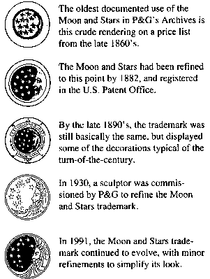
 5. Procter & Gamble- the manufacturer of many different products such as Febreze, Charmin, Puffs, CoverGirl, Ivory, Herbal Essences, Vicks, Swiffer, Crest, Gillete, and other brands. This company was started in 1837 as a family-operated soap and candle producer.
I think the logo needs some kerning. Some letters touch and some don't. The words as a whole look too squished together.
Thursday, January 15, 2009
UK Mac commercials
I stumbled upon these a couple years ago and found the characters very funny and British.
Wednesday, January 14, 2009
Logos I like:
I like it because it works with the name, but makes it more grandiose, just as Hollywood makes things more illustrious. To me, the stars reiterate movie stars, above the clouds, held above regular life.
 2. USA Network: Owned by NBC Universal, USA Network was started in 1977. It is an American cable network that shows original and syndicate television shows, as well as edited movies. Their slogan is "characters welcome". I first noticed their logo while watching "Pirates of the Caribbean" last year, and found it to be simple, but clever and eye catching. They use figure-ground relationship to their advantage to create the "s", making the logo interesting and memorable.
I like this logo because of its versatility. The designers are constantly thinking of new ways to "dress" the M. The logo is unmistakable, but is interesting because it is also static and ever-changing. Designer Alan Goodman states that the logo "has movement even as it sits there. It already has action because something is always being done to it." I like the nature of it and I think it works well with the identity of the company. This channel displaying the current music trends is targeting the young adult demographic. This is a static age, and trends are constantly changing, therefore the logo parallels with the nature of this while also being bold.

5. MasterCard: This company began in 1966 as the Interbank Card Association, going global in 1968. The logo was designed to represent the merging of commerce between two hemispheres: the "golden" West and the Eastern world (red). The world unites under the trusted name of MasterCard. This logo is current since 1996, but they have recently rebranded their corporate identity, now calling themselves "MasterCard Worldwide". Hopefully they will keep their old logo on the cards and ads. The new one was said to "reflect the company's unique, three-tiered business model as a franchiser, processor, and advisor", but I don't see it as being as successful as the old logo.
,
,
Thursday, January 8, 2009
Pepsi rebranding?
Recently, in the Fall of 2008, Pepsi underwent a rebranding of many products such as Pepsi, Diet Pepsi, Pepsi Max, Sierra Mist, and Mountain Dew. Pepsi has not had this much of an identity change since 1987. The design firm responsible for this change is Arnell, whose clients include big names such as M&M's, McDonald's, Dodge, Chrysler, Bank of America, and many others. It took about 5 months for them to develop the new design.
The Vice President of PepsiCo.'s marketing, Frank Cooper, is positive in this new action. "We felt like, as we move out of this traditional mass marketing and mass distribution era into today's culture, there's an opportunity to bring humanity back, both in terms of the design but also in the way we engage consumers. By making the logo more dynamic and more alive ... [it is] absolutely a huge step in the right direction."
 The new Pepsi logo includes a sequence of "smiles", according to the type of product. Diet Pepsi has a smile, Pepsi has a slightly larger grin, and Pepsi Max has a laugh. The design is simple, but with the added variation in the degree of the white shape. The font is reminiscent of Diet Pepsi in the 70's.
Mountain Dew, which is now being called "Mtn Dew", and Sierra Mist also changed their design. The new Mtn Dew is different on the bottle compared with the can, as if they couldn't make up their mind. The can looks dramatic and sharp, and has green icicle-looking shapes. Sierra Mist is set on a green background of trees. Sierra is the same typeface as the pepsi products, but mist is edged in blur, to create a mist look.
The general reaction to the new branding is disapproval, but there are mixed opinions, of course. Change at first can often bring uproar, but the public may settle down once they become more used to it. People have said that the new Pepsi logo is reminiscent of Obama's recent campaign.
Personally, I hate the new design. I don't like Pepsi, and I feel that they've always tried to be better than Coke, but this time is proving to be disastrous. Coca-Cola has changed their look a little bit over the years (I've especially noticed frequent changes in Cherry Coke) , but they have always had consistently great design. I think the new Pepsi look is going toward simplicity, but trying to appeal to a younger generation, using sleek, simple shapes and a more modern, but soft looking type treatment. I absolutely hate that Mountain Dew decided to abbreviate to Mtn. Maybe they were trying to appeal to all of the younger generation by tapping into the txt language? Is everything going to be shortened now, just because people are too lazy or busy to write an entire word? The can, on the other hand, looks angry to me. It's sharp and dramatic. Sierra Mist... ugh. The first thing I think of is urinating in the middle of the woods. I can't get past that. It also reminds me of some horrifying haunted woods.

Bottom line: Pepsi can't top Coca-Cola.

The Vice President of PepsiCo.'s marketing, Frank Cooper, is positive in this new action. "We felt like, as we move out of this traditional mass marketing and mass distribution era into today's culture, there's an opportunity to bring humanity back, both in terms of the design but also in the way we engage consumers. By making the logo more dynamic and more alive ... [it is] absolutely a huge step in the right direction."
The new Pepsi logo includes a sequence of "smiles", according to the type of product. Diet Pepsi has a smile, Pepsi has a slightly larger grin, and Pepsi Max has a laugh. The design is simple, but with the added variation in the degree of the white shape. The font is reminiscent of Diet Pepsi in the 70's.Mountain Dew, which is now being called "Mtn Dew", and Sierra Mist also changed their design. The new Mtn Dew is different on the bottle compared with the can, as if they couldn't make up their mind. The can looks dramatic and sharp, and has green icicle-looking shapes. Sierra Mist is set on a green background of trees. Sierra is the same typeface as the pepsi products, but mist is edged in blur, to create a mist look.
The general reaction to the new branding is disapproval, but there are mixed opinions, of course. Change at first can often bring uproar, but the public may settle down once they become more used to it. People have said that the new Pepsi logo is reminiscent of Obama's recent campaign.
Personally, I hate the new design. I don't like Pepsi, and I feel that they've always tried to be better than Coke, but this time is proving to be disastrous. Coca-Cola has changed their look a little bit over the years (I've especially noticed frequent changes in Cherry Coke) , but they have always had consistently great design. I think the new Pepsi look is going toward simplicity, but trying to appeal to a younger generation, using sleek, simple shapes and a more modern, but soft looking type treatment. I absolutely hate that Mountain Dew decided to abbreviate to Mtn. Maybe they were trying to appeal to all of the younger generation by tapping into the txt language? Is everything going to be shortened now, just because people are too lazy or busy to write an entire word? The can, on the other hand, looks angry to me. It's sharp and dramatic. Sierra Mist... ugh. The first thing I think of is urinating in the middle of the woods. I can't get past that. It also reminds me of some horrifying haunted woods.
Bottom line: Pepsi can't top Coca-Cola.