 1. Connecticut Sun- This logo was unveiled in 2003 for the WNBA team. The design includes the modern interpretation of the ancient Mohegan symbol for the four corners of the earth. Apparently, "numerous designs were developed with the focus on simplicity, imagery and inclusion of a Mohegan Tribal symbol". It was developed by Outthink, a marketing agency and NBA Entertainment and Essex.
I can deal with most of the logo, but the word "Sun" is hideous. It's tacky and unprofessional. It doesn't scream fierce. The only way that it hints the sun in the word itself is by the color.

2. Stanwood Free Methodist Church- a church in Stanwood, Michigan. They have a terrible website too. Let's hope that their passion for God far exceeds their passion for design. I don't like the typeface or the way it is bent around the image. They tried a little too much to combine the heart and bird image. It looks like bad clip art.
 4. Dean Hunter & Co. Pest Control- found in Anderson, SC. This is a pest control place, but you can't tell it from the actual logo with the lovely yellow explosion. If Dean Hunter is one name, it should function as one style so it looks uniform. Dean is totally different from Hunter. To make matters worse, the "H" is huge, and the remainder of the word is in smaller caps. "Dean" is divided in attempts to make the negative space connect with the explosion to the side, but it looks terrible in this way. Company is shown with the O inside of the C. I mistook this for an odd symbol like a swirl, but realized the & would be missing "company".
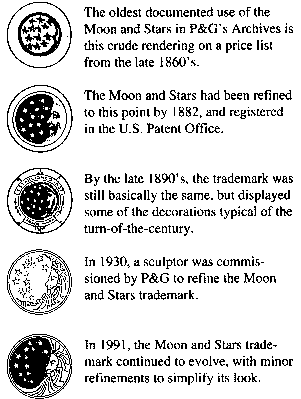
 5. Procter & Gamble- the manufacturer of many different products such as Febreze, Charmin, Puffs, CoverGirl, Ivory, Herbal Essences, Vicks, Swiffer, Crest, Gillete, and other brands. This company was started in 1837 as a family-operated soap and candle producer.
I think the logo needs some kerning. Some letters touch and some don't. The words as a whole look too squished together.
0 comments:
Post a Comment