Saturday, August 22, 2009

Walter Dorwin Teague


Walter Dorwin Teague (1883-1960) was an Art Deco designer that we can credit the fabulous Nocturne and Bluebird Radios to. He was born in Decatur, IN, but moved to New York at age twenty, where he attended the Art Students League in New York from 1903-1907, studying painting. He went on to be a professional graphic designer illustrating magazines. Later, he worked for Eastman Kodak in 1928 where he designed the Brownie (Baby Brownie in 1934 and the Hawkeye Brownie in 1950). In 1944, he was named the first president for the Society of Industrial Designers (SID).

My favorite design he did is the Nocturne and Bluebird radios.

I first saw the Nocturne at the High Museum in Atlanta. It is a beautiful floor model radio that stands about 3.8 feet high., a dazzling round piece of blue mirror and neat silver embellishments in all Art Deco glory.


The Nocturne was released in 1936 by Sparton Corporation, selling at $375. An advertisement in that day described the radio as "a daring and brilliant ensemble in glass and metal by Walter Dorwin Teague…A circle of midnight blue Tufflex mirror glass rests in a satin chrome cradle…Beautiful state setting for High Fidelity receiver cleverly concealed behind the chrome barred grille."


The Nocturne:


There are not many Nocturne radios left, but the starting price for an authentic one would be around $25,000. The Bluebird is like the sister to the Nocturne. It is a smaller version that came out around the same time, standing a little over 1 foot tall. In 1934, the price of one was around $40-$45. Now, an authentic Bluebird is worth from $2000-$3500 (maybe over!). Just a replica is usually listed at $150. I was lucky enough to find one on Craigslist last year for $50. I love blue shiny things.


The Bluebird:

Friday, August 7, 2009

Corcoise

Here's a few things from L Filipe dos Santos' portfolio. He is also known as Corcoise. He also has a blog. I just love his sketches and style of drawing/illustration. Very fun to look at.


Here are some really neat drawings he does by just starting with puddles of color in his sketchbook:


On cardboard- I really like the texture and the way the cardboard shows through in some areas. I like the combination with the charcoal and flat color.

Thursday, August 6, 2009

I stumbled upon this on www.atissuejournal.com. Can you recognize the logos they come from?

Thursday, July 30, 2009

Angels and Demons

I finished reading Angels and Demons by Dan Brown (I read the whole book in Barnes & Noble!). He also wrote The Da Vinci Code, which I read a couple years ago, but several people said that Angels and Demons is better. I would usually just roll my eyes if his books are brought up in conversation, but somehow I find them mildly entertaining and a good read for fun. I don't take any "facts" in the book seriously, and I think a lot of what he proposes as the behind-stories of artists and their work is proposterous.

But I did find the ambigrams kind of interesting. Ambigrams are typographical designs that are symmetrical, usually one or two words, that can be read the same way upside down. The type used in the book was rotational ambigrams, but there are several different kinds (mirror-image, figure-ground, spinonym, symbiotogram, etc.).

Here is the illustrations of the ambigrams from the book:

Tuesday, July 28, 2009

With every end, another beginning...

(7/16/08)


(7/28/09)


I'm almost at the end of my 8th journal. On one of the first pages, I did a Prismacolor drawing of my favorite coffee cup (made and given to me by Diana Morrow), so I found it fitting to do the same coffee cup at the end, this time in watercolor.

I love journaling. It helps me process things better and is a great reference if I want to look back at past events. It is a constant reminder that I am growing and changing, but it also teaches me from my mistakes and shows me who I used to be.

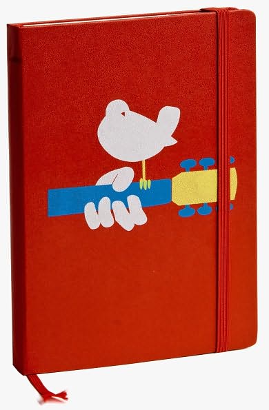
This is the kind of diary my 9th journal will be. I just purchased it at Barnes and Noble the other night. Moleskine came out with special edition Woodstock notebooks to celebrate the 40th anniversary. I chose this one because this particular poster has kind of a sentimental meaning to me from a story I would rather not explain. Hopefully, I will be able to start this one on my 21st birthday, which is six days away.


Thursday, July 23, 2009

Looking forward to March 5, 2010!


Check out the newly released trailer! I am so excited about this movie!

Tuesday, July 21, 2009

Here am I
left
an empty shell
a vessel filling with sorrow
until the brim overflows
and all inside is hollow again
How much more can this empty frame take
Racked in grief
Searing to the very core of
where I belong
who I
once was.
Never will be again.
I lay my head upon the grass
Inhale the scent of the earth
for she is in it
Quiet, in the dark night
The wind whispers of her presence
Alive on another plane.
I call to her, my driven words dropping in the same air
from which she took her last breath, but
Never reaching the other side.